Routing High-Voltage Power Lines Across Three Provinces — With Satellites, LiDAR, and Drones
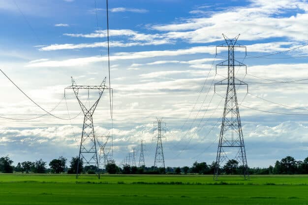
Working with ESRI Thailand (G-Able), I designed the route for a high-voltage transmission line crossing three provinces in southern Thailand, where the governing constraint wasn't distance or cost but avoiding buildings — every house in the corridor means land acquisition, compensation, and real disruption to families. I built the analysis as a multi-resolution funnel: Landsat 8 imagery processed in ENVI auto-digitized land cover across the whole region (built-up areas, roads, vegetation) to narrow hundreds of possible routes down to a few plausible corridors; LiDAR then supplied the vertical dimension those corridors needed — terrain elevation, building heights, and canopy height for conductor clearance; and drone imagery covered the final stretches where two alignments were close enough that individual structures decided it. Filtering cheaply at wide scale and reserving the expensive sensors for the genuinely hard decisions turned a subjective routing argument into a defensible comparison: how many structures does each alignment affect, and what land has to be bought.
Some projects teach you technical skills. This one taught me that the hardest constraint in an engineering problem is often not physics or budget — it's people's homes.
A while back I worked with ESRI Thailand (G-Able) on the route design for a high-voltage transmission line that had to cross three provinces in southern Thailand. On paper, the task sounds simple: draw a line from A to B and put towers along it. In practice, it was one of the most interesting geospatial problems I've worked on, because the objective function wasn't "shortest" or "cheapest." It was "pass through as few buildings as possible."
Why buildings drive everything
In Thailand, when a transmission line has to cross private land, the utility has to acquire the right-of-way underneath it. If the corridor clips someone's house, that isn't a line item in a spreadsheet — it's a family that has to be compensated, negotiated with, and sometimes relocated. It's slow, it's expensive, and it's genuinely disruptive to people who never asked to be in the path of a power line.
So the routing problem inverted itself. Instead of optimizing purely for distance and terrain, we were optimizing for avoidance. Every building along the corridor was a penalty. Every stretch of empty land was an opportunity. The engineering question became a data question: how do we know, precisely and at scale, where every building, road, and tree is across hundreds of kilometres of countryside?
You can't send surveyors to walk three provinces. So we built the answer from remote sensing.
Layer one: Landsat 8 for the regional picture
The first pass used Landsat 8 imagery processed in ENVI. Landsat is the right tool for the widest zoom level — free, consistent, multispectral, and covering enormous areas in a single scene. In ENVI we ran supervised and index-based classification to auto-digitize broad land cover: built-up areas, vegetation, water, bare ground, and the road network.
It's worth being honest about what this layer can and can't do. Landsat 8 gives you 30 m multispectral resolution (15 m panchromatic). At that scale you are not tracing individual rooflines — a single pixel can swallow a small house. What Landsat did give us was the strategic view: where the settlement clusters are, where the agricultural land opens up, where forest canopy and water bodies sit, and roughly where the viable corridors might run.
That's exactly the right job for it. Landsat narrowed hundreds of possible routes down to a handful of candidate corridors. It answered "which valley?" not "which house?"
The vegetation classification mattered for a second reason too: trees under a high-voltage line have to be cleared and kept cleared. Canopy along a corridor is a recurring maintenance cost and a flashover risk, so mapping it early changes the economics of a route.
Layer two: LiDAR and drone imagery for the decisions that matter
Once the candidate corridors were narrowed, the resolution had to jump by orders of magnitude — and that's where LiDAR and drone imagery came in.
LiDAR gave us what satellite imagery fundamentally cannot: the third dimension, with precision. From the point cloud we could separate the digital surface model from the bare-earth terrain model, which meant we could measure:
- Ground elevation along the corridor, for tower siting and sag calculations
- Building heights, not just building footprints
- Canopy height, which determines clearance requirements far better than a 2D vegetation mask
- Existing infrastructure — other lines, poles, structures already in the corridor
Conductor clearance is a vertical problem. A 2D map tells you a tree is there; LiDAR tells you it's 18 metres tall and will violate the safety envelope at mid-span.
Drone imagery filled the last gap — centimetre-level detail over the specific stretches where the routing decision was genuinely close. When two candidate alignments differed by a handful of structures, we flew them and looked. At that resolution you can see individual houses, outbuildings, fences, small temples, cemeteries, farm structures, and access tracks. You can see the things that don't appear in any national dataset but absolutely appear in a community meeting.
Fusing it together
The real work was integration. Three data sources, three resolutions, three acquisition dates, three coordinate handling quirks — and one corridor decision at the end of it.
The pattern that emerged was a funnel:
Layer
Landsat 8 + ENVI
LiDAR
Drone
Scale
Regional (3 provinces)
Corridor (km)
Local (m)
Question it answers
What's the terrain, height, and clearance situation?
What's the terrain, height, and clearance situation?
Exactly which structures does this alignment touch?
Each layer eliminated options so the next, more expensive layer only had to look at what survived. You don't fly drones over three provinces. You fly them over the two kilometres where the decision is actually hard.
The output was a set of alignment options that could be compared on a concrete, defensible metric: how many structures does each one affect, and what land has to be acquired? That turns an argument into an analysis. Instead of "this route feels better," you can say "this alignment affects eleven structures, this one affects three, and here's the map."
What I took away from it
The metric defines the engineering. Optimize for shortest distance and you get one line. Optimize for minimum land acquisition and you get a completely different one. Getting the objective right mattered more than any single technical choice downstream.
Multi-resolution beats high-resolution. The instinct is to want the sharpest data everywhere. But the value came from the combination — cheap wide coverage to eliminate, expensive fine coverage to decide. Same principle shows up constantly in data pipelines: filter cheaply, then compute expensively on what's left.
Geospatial work has a human endpoint. Every polygon we classified as "building" was somebody's house. It's easy to forget that when you're staring at a classified raster in ENVI at 11pm. The whole point of the project was that being careful with the data upstream meant fewer families disrupted downstream. That framing has stayed with me across a lot of work since — including work that has nothing to do with satellites.
If you're working on something similar — corridor routing, land-use classification, or multi-sensor fusion — I'm always happy to compare notes.